Travertine brings warmth without relying on bold color or busy pattern. Its soft pores, mineral markings, and sandy tones give walls, floors, and built-in features a relaxed character that works especially well with wood, plaster, linen, and aged metals.
The strongest travertine details usually come from controlled placement. A narrow border, fireplace surround, vanity backsplash, or threshold can create more impact than covering every surface with stone.
Let Natural Variation Become Part of the Design
Travertine isn’t meant to look perfectly uniform. Individual pieces can contain small holes, cloudy patches, darker veins, and subtle shifts from cream to beige. Mixing those differences across a surface helps the material look natural rather than manufactured.
For a quieter interior, select pieces from a similar tonal family. Spaces with rustic, Mediterranean, or organic-modern character can handle more contrast between tiles.
Choose the Finish for the Room
Honed travertine has a smooth, matte surface that suits restrained interiors. Tumbled pieces have softer edges and a more weathered appearance, making them useful for textured floors, entry details, and spaces influenced by traditional architecture.
Use Travertine Around Architectural Features
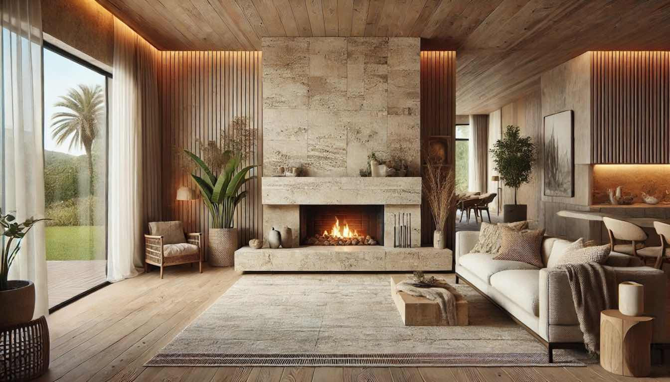
A fireplace is an ideal place to introduce stone because it already acts as a natural visual anchor. A simple surround using broad travertine pieces can add depth without requiring elaborate molding or decorative carving.
Similar ideas appear throughout outdoor surface inspiration, where material transitions often help separate gathering areas from surrounding architecture. Indoors, the same principle works around hearths, niches, built-in shelves, and structural columns.
Keep nearby finishes simple. Travertine becomes easier to appreciate when surrounding walls aren’t competing with strong patterns.
Create Better Transitions Between Materials
Travertine works particularly well where one material meets another. A narrow stone strip between timber flooring and tile can make the change feel intentional rather than accidental.
Design collections focused on residential material ideas also show why repeated tones matter. Matching the stone’s beige, ivory, or warm-gray undertones with cabinetry and flooring creates connection even when the materials themselves are different.
| Detail | Good Placement | Visual Effect |
|---|---|---|
| Narrow trim | Doorways and niches | Subtle definition |
| Large slab | Fireplace surround | Calm focal point |
| Tumbled pieces | Entry or mudroom | Relaxed texture |
| Stone threshold | Floor transitions | Finished separation |
Add Smaller Travertine Accents
Large surfaces aren’t always necessary. A floating shelf, vanity ledge, shower niche, bench top, or windowsill can introduce natural stone without making the room feel heavy.
Ideas around comfortable interior styling can translate well here because tactile materials often make neutral rooms feel less flat. Travertine adds this effect through texture rather than extra decoration.
Pair small stone accents with oak, walnut, brushed brass, blackened steel, or textured fabric. These combinations prevent pale travertine from appearing washed out.
Mistakes That Can Make Travertine Feel Dated
Using several ornate stone details in one room can push travertine toward an older, heavily decorated style. Decorative borders, carved edges, patterned inserts, and highly contrasting grout don’t all need to appear together.
Another mistake is choosing the stone without considering nearby lighting. Warm artificial light can intensify yellow undertones, while cooler daylight may make gray-beige pieces look noticeably colder.
Sample the actual material in the room before committing to a large installation.
Frequently Asked Questions
Does travertine work in modern interiors?
Yes. Large-format pieces, straight edges, limited grout lines, and honed finishes can make travertine feel clean and contemporary. Keeping surrounding materials restrained helps its natural texture become the main decorative feature.
What colors look good beside travertine?
Warm whites, sand, taupe, olive, muted terracotta, charcoal, and natural wood tones usually coordinate well. The best choice depends on whether the particular stone leans cream, gold, beige, or gray.
Should travertine details match throughout a house?
They don’t need to be identical. Repeating a similar finish or undertone is usually enough to create continuity while allowing fireplaces, bathrooms, entryways, and kitchens to use the material differently.
Let the Stone Do Less but Mean More
Travertine usually looks strongest when it has a clear purpose. Use it to frame an architectural element, finish an edge, create a transition, or add tactile contrast to a simple room.
Before choosing quantity, decide where natural texture will matter most. A few well-placed travertine details can give a home lasting warmth without turning every surface into a stone feature.